|
|
|
|
|
|
|
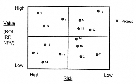
quantitative measures as described in Section IV.D. Figure 8 provides an illustration of one approach. |
|
|
|
|
|
|
|
|
This sort of display gives an easy first insight into the portfolio balance with those projects in the upper right quadrant being the most attractive and those in the lower left being the least immediately attractive. If the analysis shows the majority of projects in one quadrant, it may suggest a grossly unbalanced portfolio or a fault in data gathering, review, or analysis. The presentation, however, has limited value. Though it gives a feel for risk/reward balance, it does not assess the degree of financial exposure represented by the distribution of projects nor does it give an easy means of relating the picture to the company's own attitude to risk. Fortunately, this information is added relatively easily. |
|
|
|
|
|
|
|
|
First, the individual points representing each of the projects can be drawn to show forecast cost or resource demand. |
|
|
|
|
|
|
|
|
Figure 9 shows the same set of projects as shown in Fig. 8 but redrawn so that the forecast resource utilization over a fixed period is represented by the area of each point. The important lesson is that, though significant numbers of projects appear in the lower portion of the graph, the majority of the resources are allocated to more attractive opportunities. Although this may be intuitively appropriate, it highlights the financial exposure to |
|
|
|
|
|
|
|
|
FIG. 8
A display plot of risk versus return. |
|
|
|
|
|